
Web page options and best practices
Welcome to the Drupal 10 block demo page. This page details all the section, block and style options available in Drupal 10 (D10) and some best practices for using them.
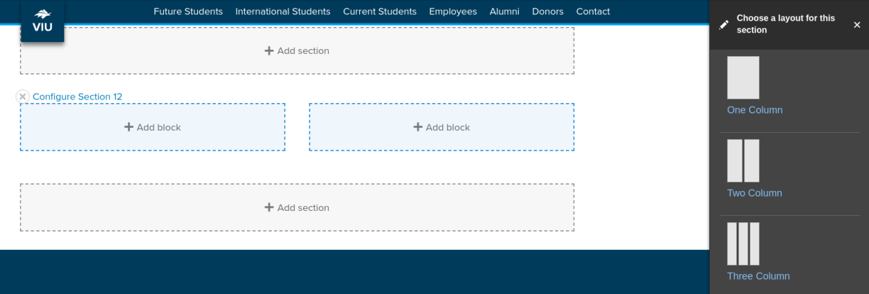
Sections
In D10, the layout tab allows you to add new sections, which are horizontal containers. The determine the structure of your page. You can choose different section layouts:
- one column
- two column
- three column
- four column
You can assign a visible title to a section. Section titles are centred. You can also add a background colour to a section.
You place different kinds of blocks inside the sections.
Full-width section
About this section
This is a full-width section with. The section title "Full-width section" is set to display. Naming section and using the centred heading is optional. Background colours are set at the section level. There are two shades of blue to choose from: Mariners Blue (used here) and VIU Blue.
Best practices for coloured backgrounds
- Use sparingly. Coloured backgrounds should make up no more than 20% of your page.
- Do not use for text heavy content.
- Avoid using link text over coloured backgrounds.
- Be careful with photos and backgrounds. Mariners Blue rarely works with photos. VIU Blue is a little better.
Three-column section
How to use columns
Columns are good for content with minimal text.
You can stack blocks
But should you? This column is made of two stacked blocks. It's fine to stack blocks in a column, but be careful your page doesn't become too cluttered.
Tip
If you want multiple rows of three-column layouts with each row lined up nicely, add new sections for each row.
Ideas stand out
Columns can be a great way to make your content stand out.
Got two or three important rules to convey? Give them each a heading and put them in columns.
Don't do this
The heading in this block is the block title with the "display title" option select. This heading is too large for a column layout. The other columns are H3 headings assigned within the body of the block. That should be the max size for column headings.
Also, in columns, always strive for consistency: the same heading styles and similar text length creates a clean column layout. This column is now also too text-heavy.
How to choose the right section
Content determines section choice
These section options help us create interesting pages, but we need to make layout choices that strengthen our message. Some layout choices will make your message more difficult to understand. For example, a lot of text in a three-column structure can be hard to read. Here are a few content and section pairings to guide you.
- two or more paragraphs of text: single column section
- text broken down into headings and short (one sentence) ideas: two or three column sections
- one photo and one or two paragraphs of text: two column sections
- two or more images: two, three, or four column sections
If you want that interesting layout with columns and coloured backgrounds, think about how you can adjust your content to convey your message in short-easy-to-follow snippets. This is a good practice for the web.
Blocks
Basic blocks and more

Blocks are where you put your content. Blocks can be moved around the page, while sections stay in place. You have many block types to choose from. The basic block, used here, has an editor with lots of options. You can add images and video and use styles. Though if you want a little more control over the placement of images, you may want to use a two-column section.
Basic block best practice
Use blocks for discrete chunks of content. Use a single block for a single idea or section of content. This allows you to make changes quickly and move sections around. It can be a little more work at the beginning, but you'll appreciate the work when you experiment with layouts or make edits.

Block image CTA
The block image CTA layers text and a CTA on top of a large image background. Block CTA options include:
full height,
- dark text on white washed image or white text on a dark washed image
- text pull to the left, right, center or none
- optional button.
A great way to break up text and add punch to the page!
Best practices for block image CTAs
Use high-quality images
Block image CTAs work best with high-quality large images. Block image CTAs change shape dramatically based on the shape of the user's screen. To ensure your image looks good on most screens follow these specs:
- 16:9 ratio
- minimum 2000 pixel length
- Single focal point with lots of background details around the focal point (no tight closeups)
Do not stack block image CTAs
Images can be a powerful addition to a web page, but overused they just become noise. And large-scale images stacked atop one another diminishes the impact of all the images.
Do not overuse block image CTAs
Use a maximum of three block image CTAs on a page. Only use the maximum if you have lots of content and can spread the block image CTAs out effectively.
Use minimal text in block image CTAs
We have tools to adjust for contrast to improve the text-over-image reading experience. But even with the added contrast, it is still a little more difficult to read copy with a photo background. So don't make your audience work too hard. Keep copy brief.

Standard width option
A block image CTA doesn't have to be full width. This image is not a strong photo with s single focal point, so it works better in the smaller format. Also, it functions more as a background when the text pull is set to "none."
Collapsible groups
Just like D7 you can create a collapsible group and format it either as an accordion or a group of tabs!
Like the other blocks mentioned previously, you can place this accordion group in any column of a section. So you could have two accoridions side by side in a 2 column section if you wish!
Anything you can put in a basic block you can add here too!

Collapsible group in tab format
Finished inputting all your content and want to switch to tabs or back? No problem, it's just an option.
Super easy to work with and edit!
Only use tabs when you have a few items. No more than four items for tabs. If your screen converts your list of tabs to multiple lines, your users may miss important details.
Best practices for collapsible groups
Do not overuse collapsible groups
Collapsible groups should not be the primary block used on a page. They are to be a secondary option. Why? Because you don't want to force your user to open a collapsible item to to get the information they need.
Collapsible groups should not be used to cram a book's worth of information onto a single page. You should remain mindful of word count. Avoid pages that exceed 3000 words. The ideal word count is 700.
Use no more than 12 collapsible items per page.
Use collapsible groups for optional information
Collapsible groups are good for details relevant to only a sub-section of your audience.
Use for FAQs at the bottom of a page
We recommend adding FAQs to primary topic pages. This is a better option than a separate FAQ page. Collapsible groups are a good choice for FAQs at the bottom of page.
Headings and collapsible groups
The main heading for the group is an H2 heading. The titles for each item in a collapsible group in an H3 heading. This impacts heading choices on the rest of the page and inside the collapsible item:
- You must have an H2 somewhere above the collapsible group.
- You cannot use an H2 inside the collapsible item. Ideally, you use only H4 and H5 inside the collapsible item.
Flex CTAs

Flex CTAs
Flex CTAs work the same as they did in Drupal 7, except for how they are added. Now you place individual Flex CTA blocks in sections.
Options!
You can customize your CTA in the following ways:
- show or hide the title
- use an image or not
- center the cta text
- Hide the button, which links the title or image instead
- add a link or not

This last Flex CTA uses the text center option. You center text in the editor, and the title and link will also center nicely.
Flex CTA in a single column
Add colour to draw attention
A Flex CTA it in a single column section with a coloured background is a great way to draw attention to important information. This section and block combination is the same as the "callout box" in Drupal 7.
Flex CTA best practices
- Use only when you have a good image and minimal (1 paragraph or less) text.
- Flex CTAs look better over white or VIU Blue backgrounds. Avoid flex CTAs over Mariners Blue backgrounds.
Image links
Image links are just as they are described: images that function as links. Image links are great for linking out to a group a topics where no additional context is required.


Image link best practices
Place in three- or four-column sections
On large screens, image links are too big in one- or two-column sections. If you have only two image links to use, you can place them in a three-column section and leave one column empty.
Limit image links to two rows
on a phone screen, those image card links come through one at a time, so you don't want too many. Two rows of four should be the maximum.
Photo gallery block
Some optional intro text allows a little lead in. This is the photo gallery block.


Photo gallery block
This block has only three photos. As you see, the one-column layout is set up for 6 images per row.
Best practices for photo gallery blocks
Use near the bottom of your page
Photo galleries are a great addition to a page, but they shouldn't be placed before the information your audience needs.
Use when you have many impressive images to share
This block type is for bonus content. Use only when there is a clear advantage to featuring lots of images. If you have lots of images, but they aren't impressive, consider skipping this.
Update regularly
Photos can look dated very quickly. Review photo galleries regularly.
These are the only social media links you should be using on your web pages.
Contacts

Dr. John Smith
A little body text to give an intro of your contact. Their background and experiences and what they do now!
A word on when to list contacts
We have contact blocks that allow for a lovely consistent layout. Before you add every person in your department think about your reader. Who is visiting your site and what are they looking for? Do they need to know every staff person and faculty member? Is there a single email address they should use for their questions instead?
There are many good reasons not to list individuals on your website:
- spam harvesting by bots, email addresses that are listed on web pages are more likely to receive spam emails
- security risks, phishing scams, password combo attacks
- targeted scams (employer impersonation, fake invoices)
- privacy
- upkeep, when there are changes to your staff you must update contact pages.
How to choose the best block
Content informs block choice
In some cases the link between content and choice is more obvious with blocks. You only choose a photo gallery if you want many photos on your page.
Where you need to be thoughtful is those blocks that combine images and photos. You don't want your desire to have a pretty page get in the way of your reader getting the information they need. When in doubt choose the simple layout option.
Styles
Alert styles
One of the best additions to Drupal 10 is styles. The new style options give us unique ways to make our message stand out without knowing code.
The highlighted text in an alert style draws attention to your message. We used to have to get the web team to do these for us. Now we can set up alerts ourselves.
Alert style best practices
- Use once per page and use only for an important message you want to draw attention to.
- Do not use as decoration.
- Use this instead of bold or italics.
Buttons
Buttons are used for calls-to-action (CTAs). This is when you want your site visitor to do something like apply or explore a topic further.
We now can use styles to create buttons. There are three button options
Button best practices
- Green button can be used only once on a page. Use it for your primary call-to-action (the most important link on your page)
- When you have several buttons close together, use white buttons
- In all buttons, use sentence case or lowercase